B Side Records & Events: Brand Identity
Brand Strategy
The Brief
to create a thorough brand identity system for a record store that offers space for events and live music.
My Plan
i decided to take a contemporary approach to the theme of vinyl records, while also still representing a vintage look and feel. brand attributes include exciting, inviting, retro, and community. the target audience is aimed towards music fans, ages 25-40.
Naming Process
B Side refers to the back side of a vinyl record disk. It is usually the second single of a 7” record, or the second half of a 12” album. Musicians often find the B Side of a record as opportunities for bonus tracks which give space for experimentation and artistic freedom.
User Research
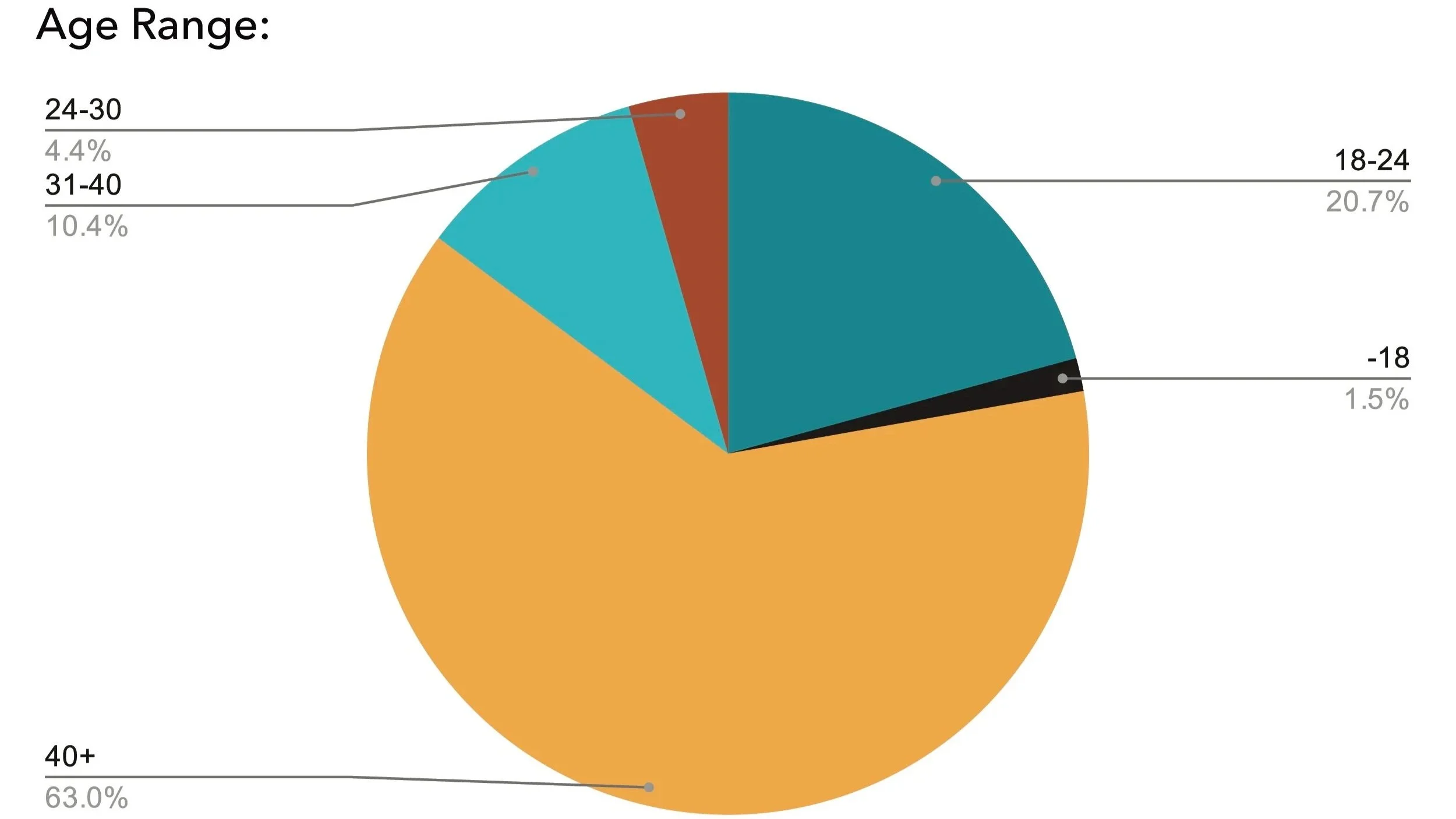
A survey was sent out online and received 136 responses from various potential users.
The age range received is majority over the age of 40, which ended up altering my target audience to cater towards an older age.
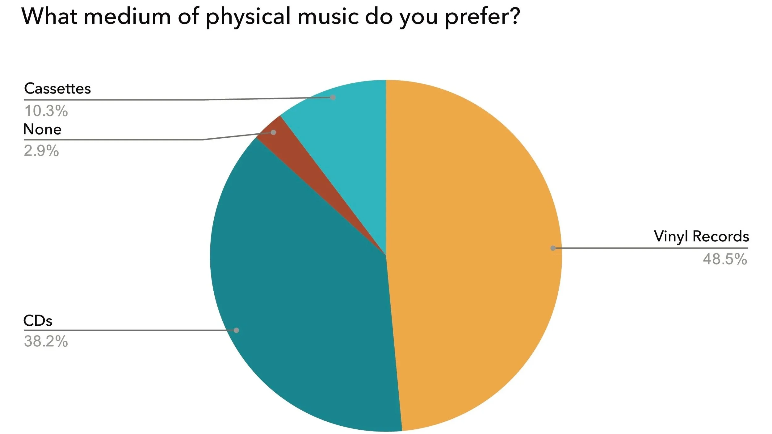
Vinyl records is the medium of physical music that was favorited from surveyors, which promotes it to be the main product B Side sells.
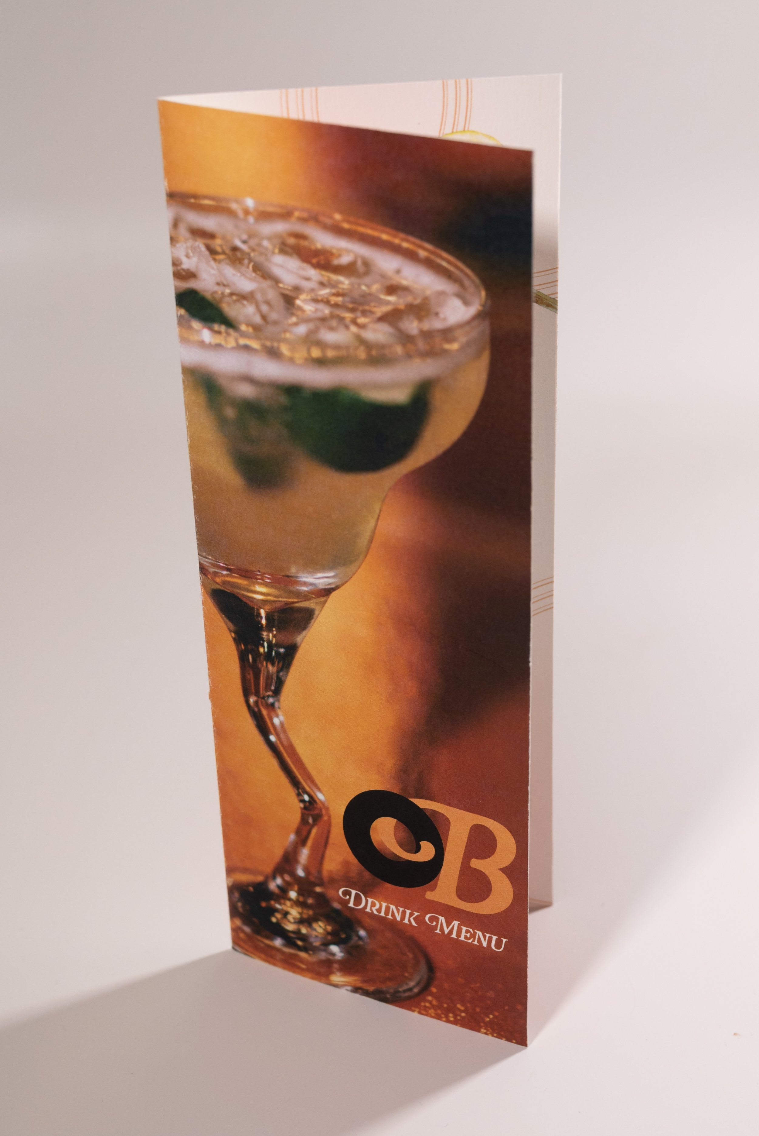
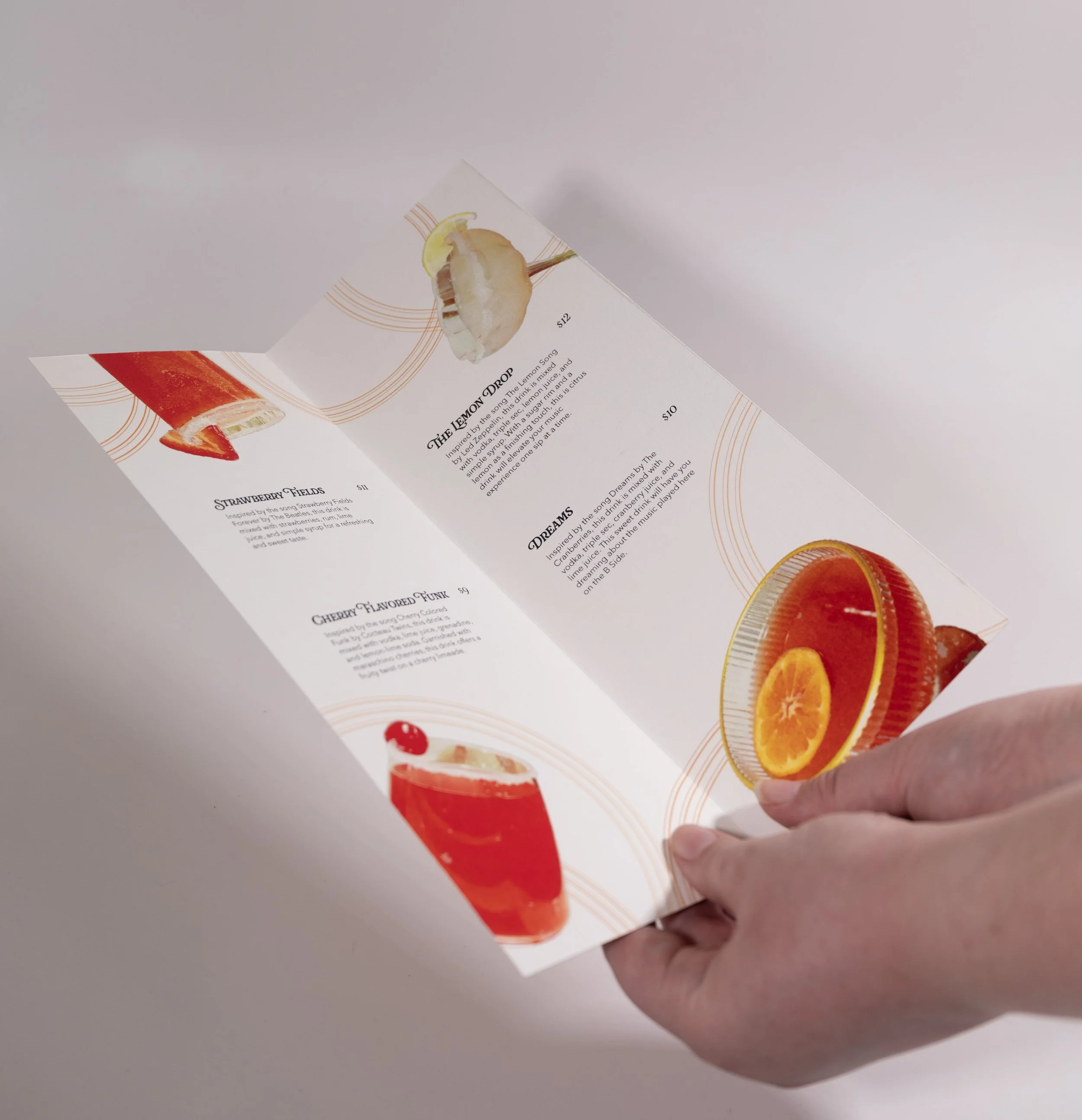
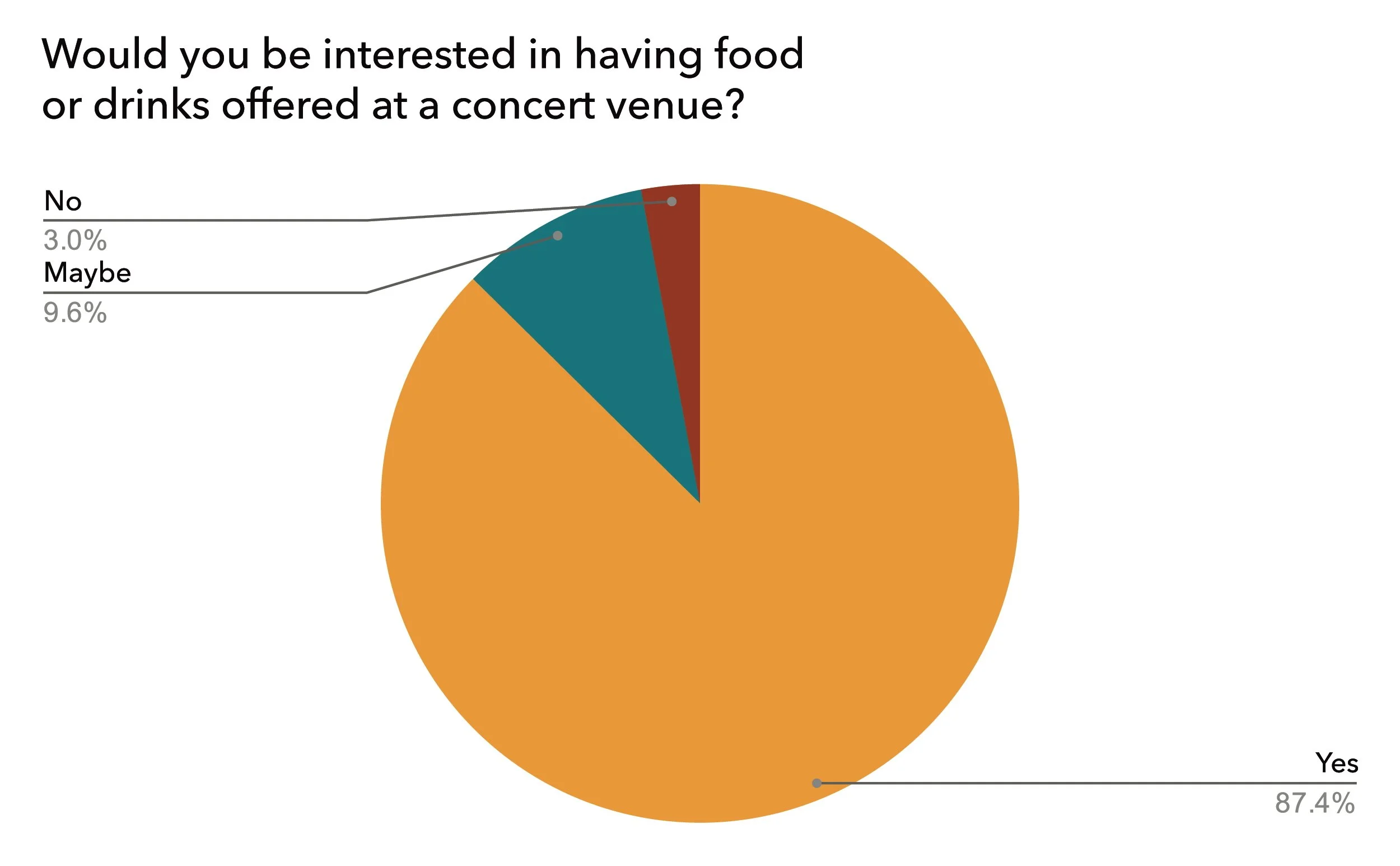
As a concert goer myself, I questioned whether to include food/beverage options. By asking in my survey, I found that users were very much interested in having food and drinks offered during events.
User Personas
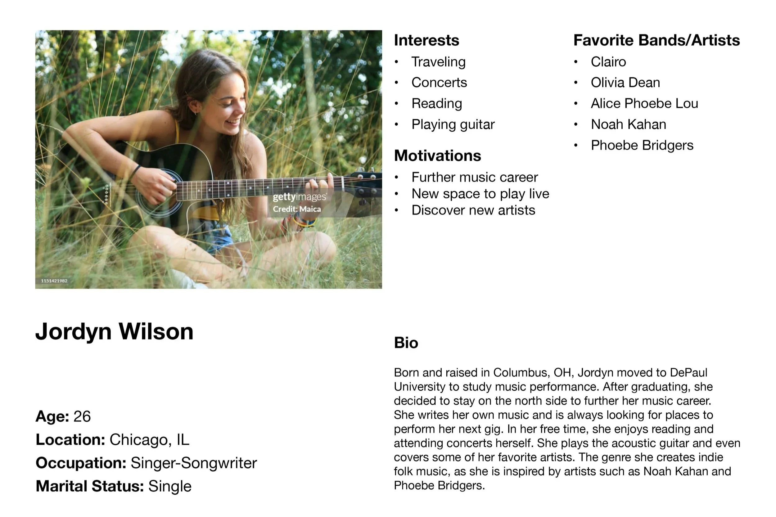
Based on the research provided, I developed two types of user personas.
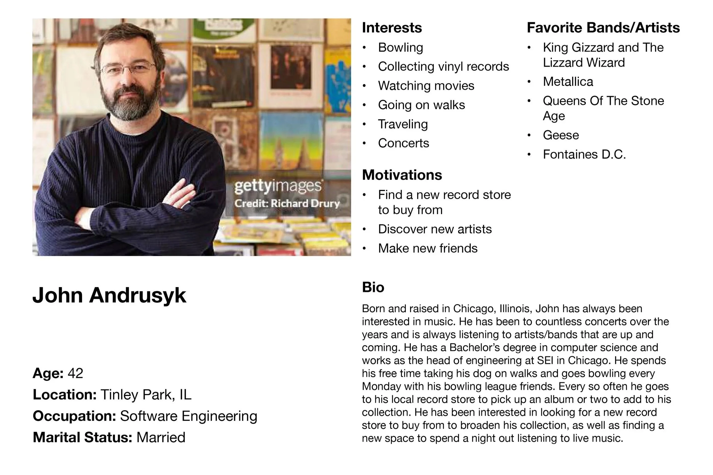
John is an example of the user that would purchase music/attend events.
Jordyn is an example of a local artist that would perform at events.
Logo Process
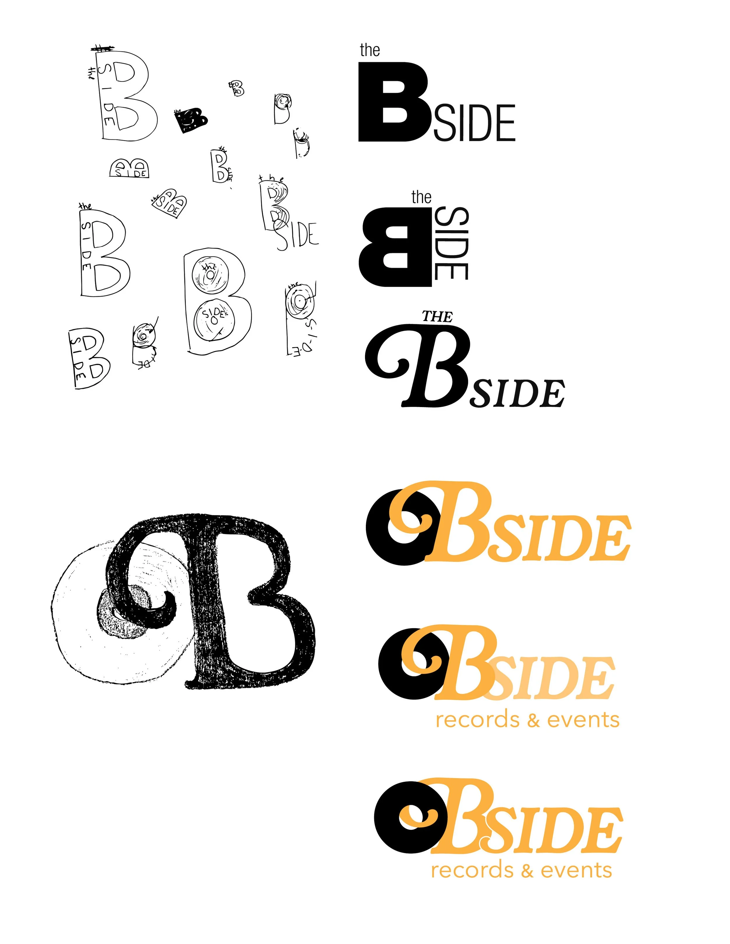
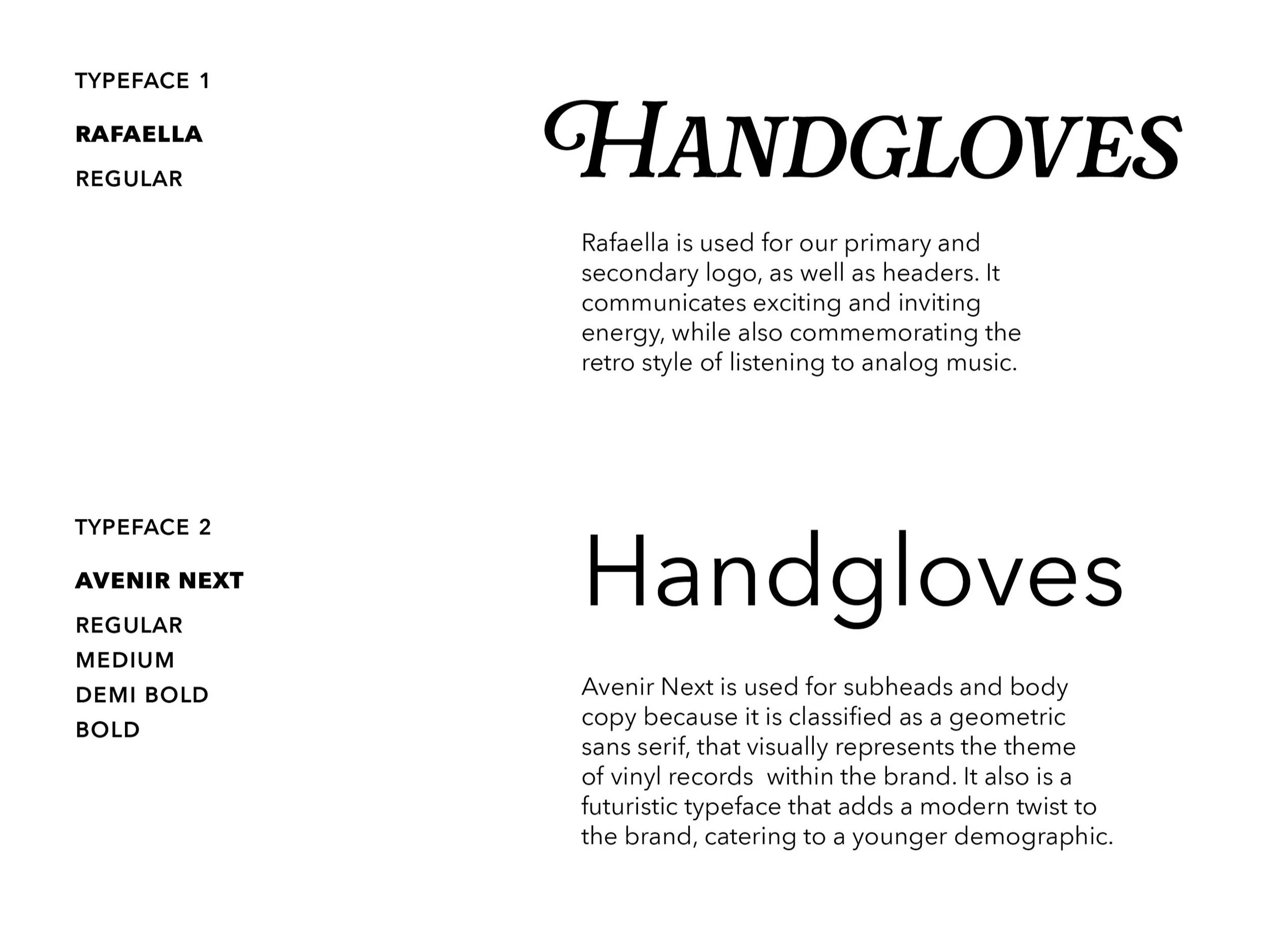
After playing around using Helvetica, I switched to Rafaella since I found it to be a more fun and exciting font. I then noticed how the swash on the uppercase B reminded me of a record player needle. So I began sketching what a record would look like next to the B. Once I put the swash through the loop of the record, I knew that it would work.I began just sketching B’s all over the page, and seeing what could/couldn’t work. I initially was interested in creating just a word mark.
I then paired the logo with ‘records & events’ in Avenir Next. Since it is a geometric sans serif, it went well with the circular theme and brought in a contemporary look.
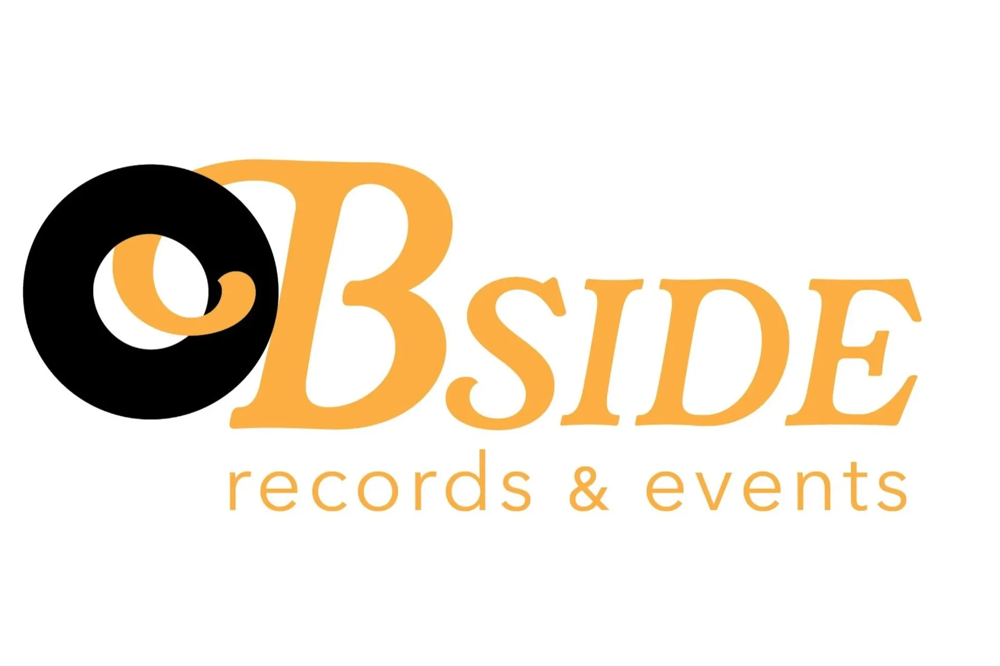
Final Logo Lockup
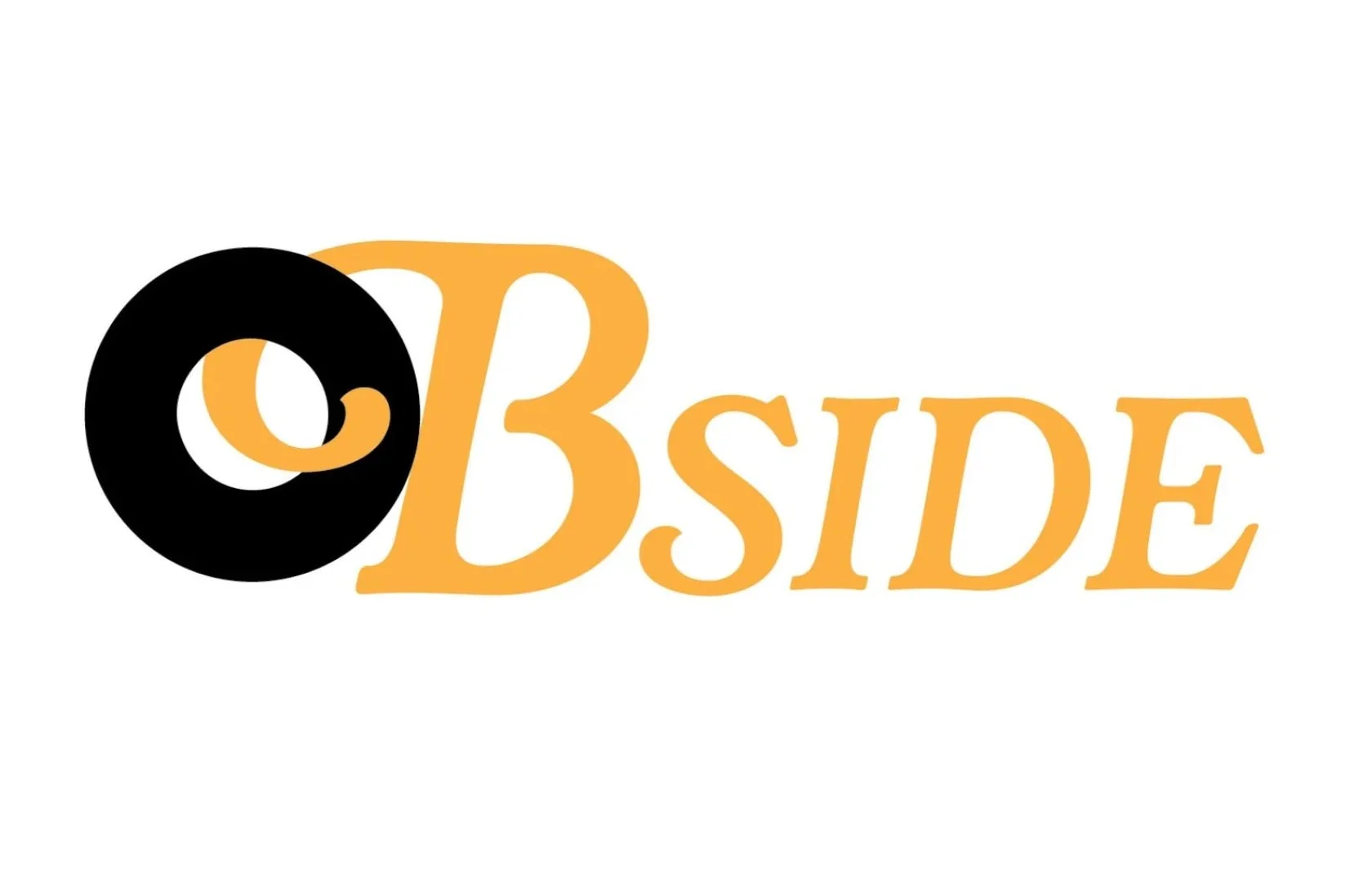

Secondary Logos
Color
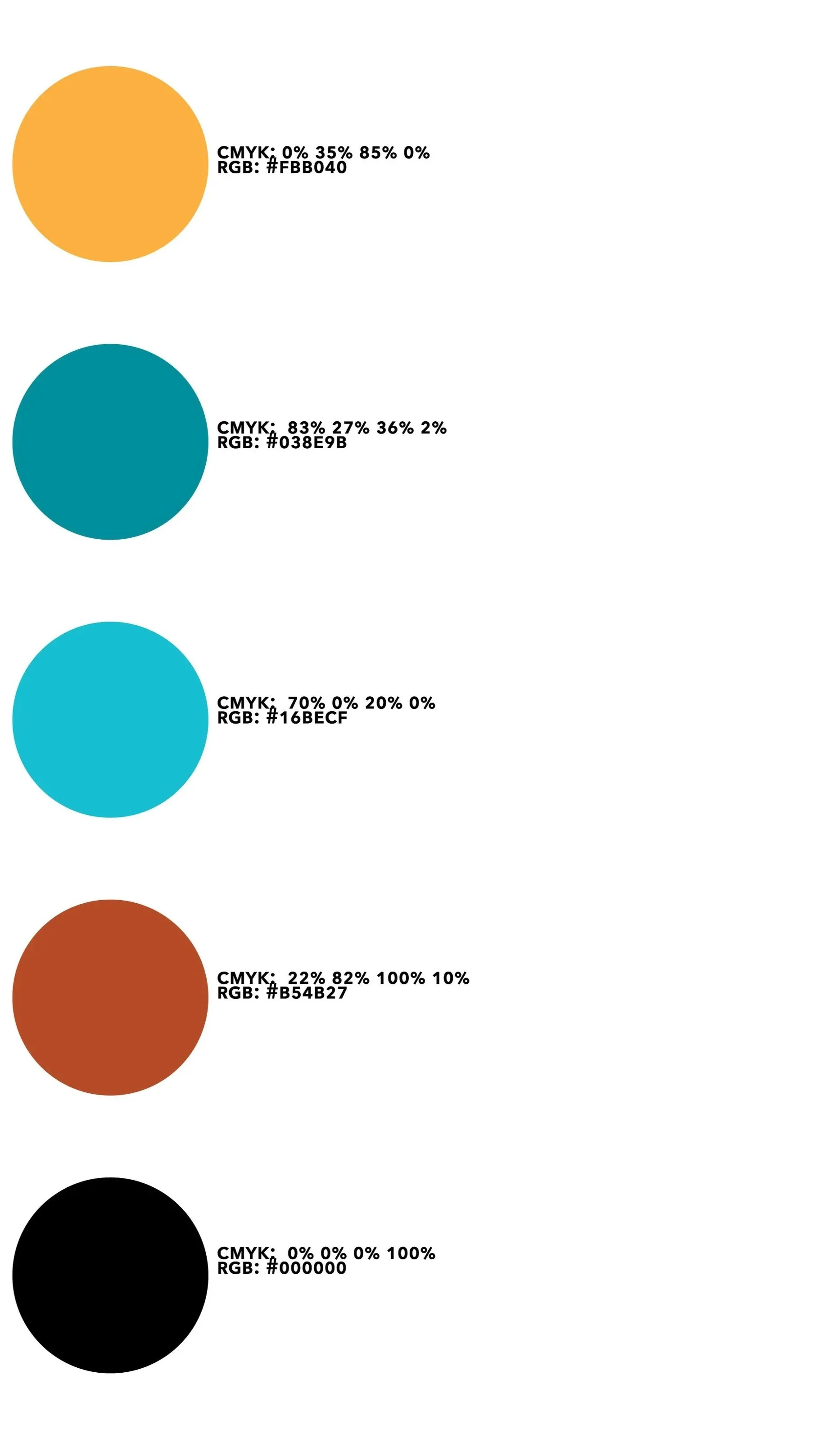
Yellow is used for the main logo, as well as secondary marks and headers. It is the primary color for B Side, as it encourages a welcoming community of users who are passionate about music.
Teal is the second color of B Side, used in secondary marks, typography, and deliverables. It acts as a complimentary color to the primary yellow used for the stores branding.
Light Teal is an accenting color for the store, as it accents the teal color. Mainly used for the background of patterns and other deliverables.
Burgandy Orange is another accenting color, as it is used for backgrounds and typography on deliverables.
Black is used for typography and assets for deliverables, and the logo.
Typography
Secondary Marks

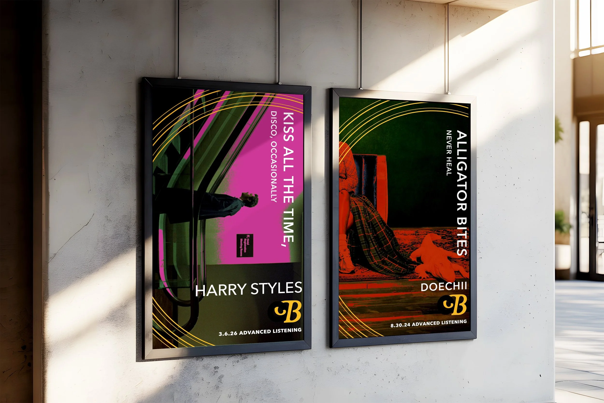
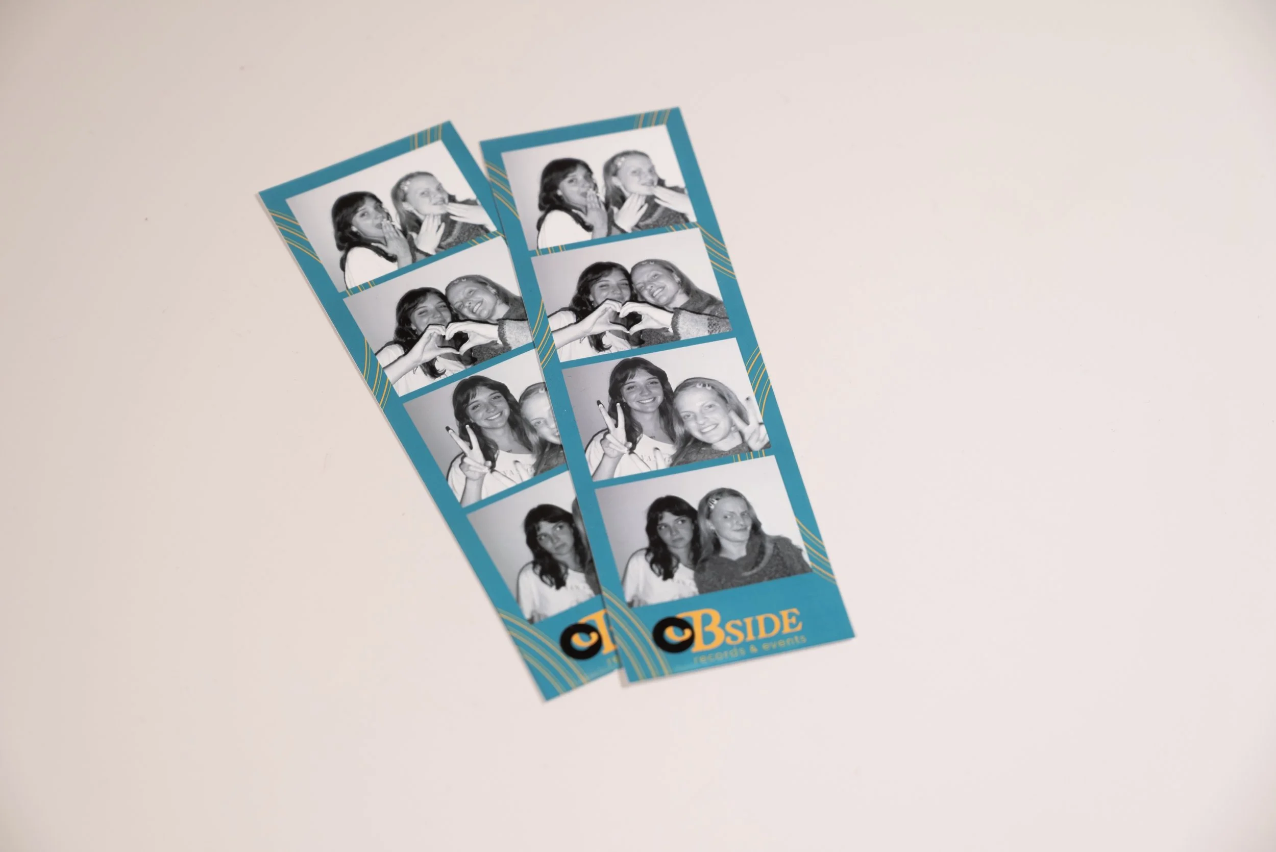
The golden rings secondary mark represents the grooves found in vinyl records, they are yellow just like the logo. This secondary mark is used on most deliverables as a decorative shape, and is repeated throughout the brand identity system.

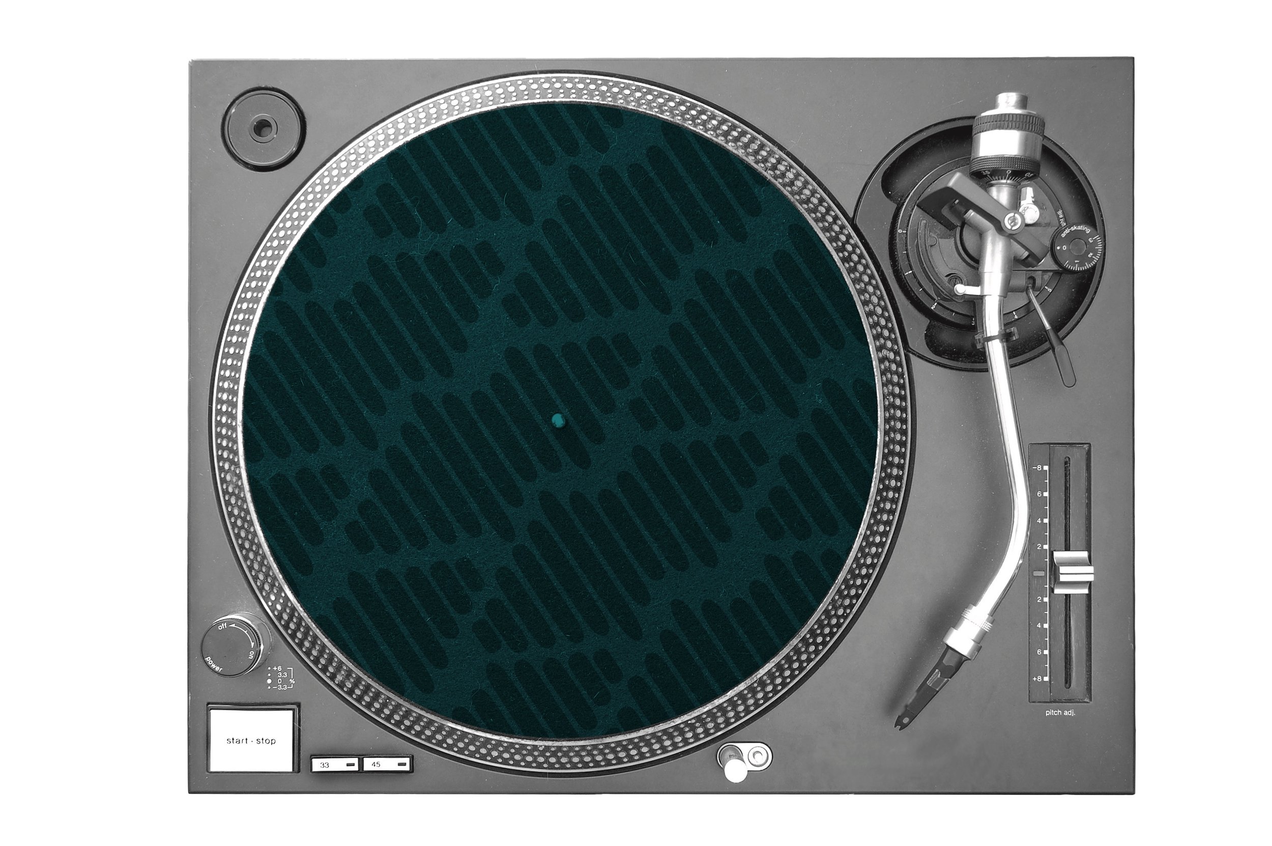
The teal soundwaves is a secondary mark used as a pattern and asset on most deliverables as well. It represents soundwaves that music creates.
Patterns & Texture

The teal sound waves pattern is seen through the visual identity, often in the background of a deliverable such as the website and slip mat.

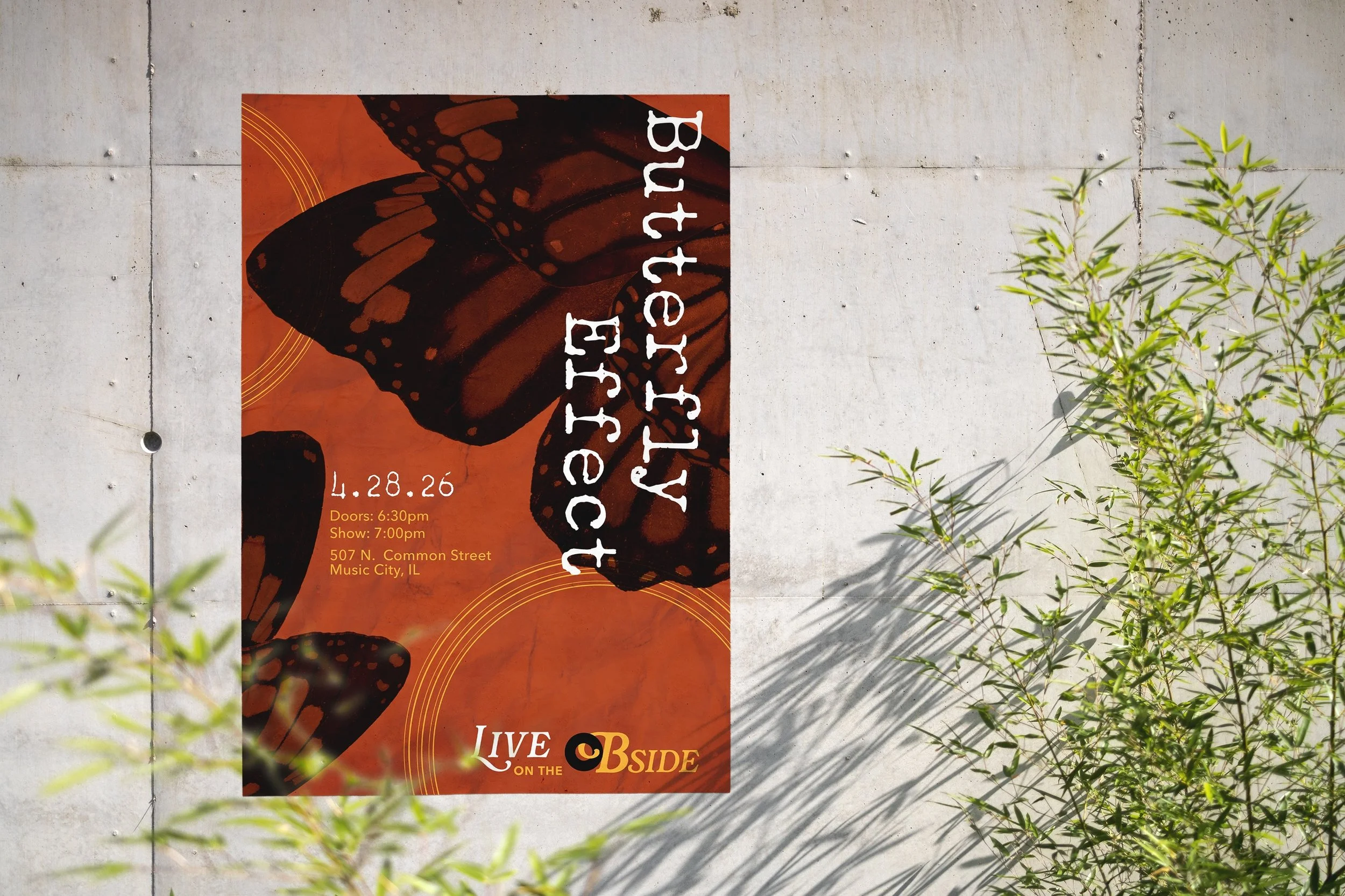
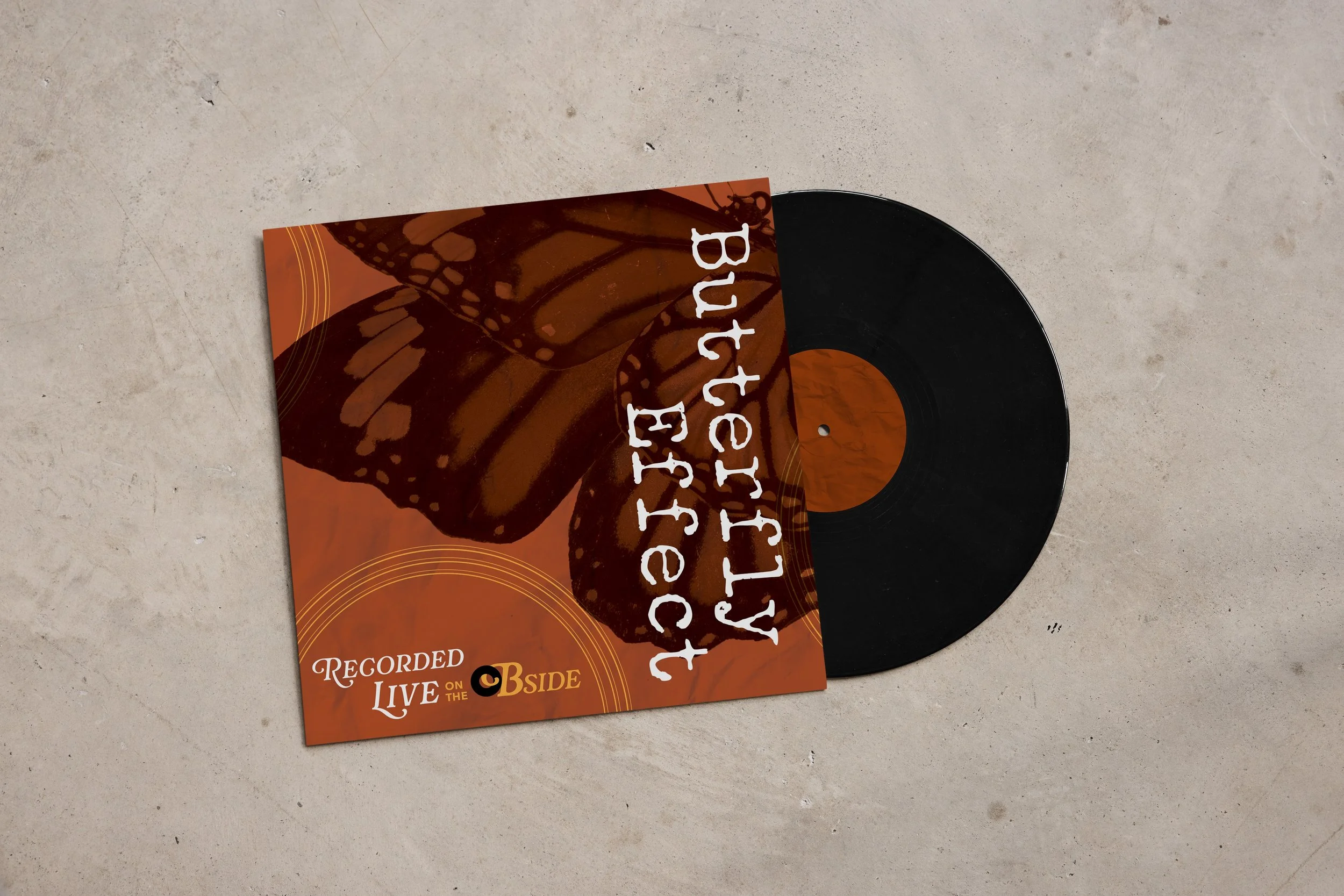
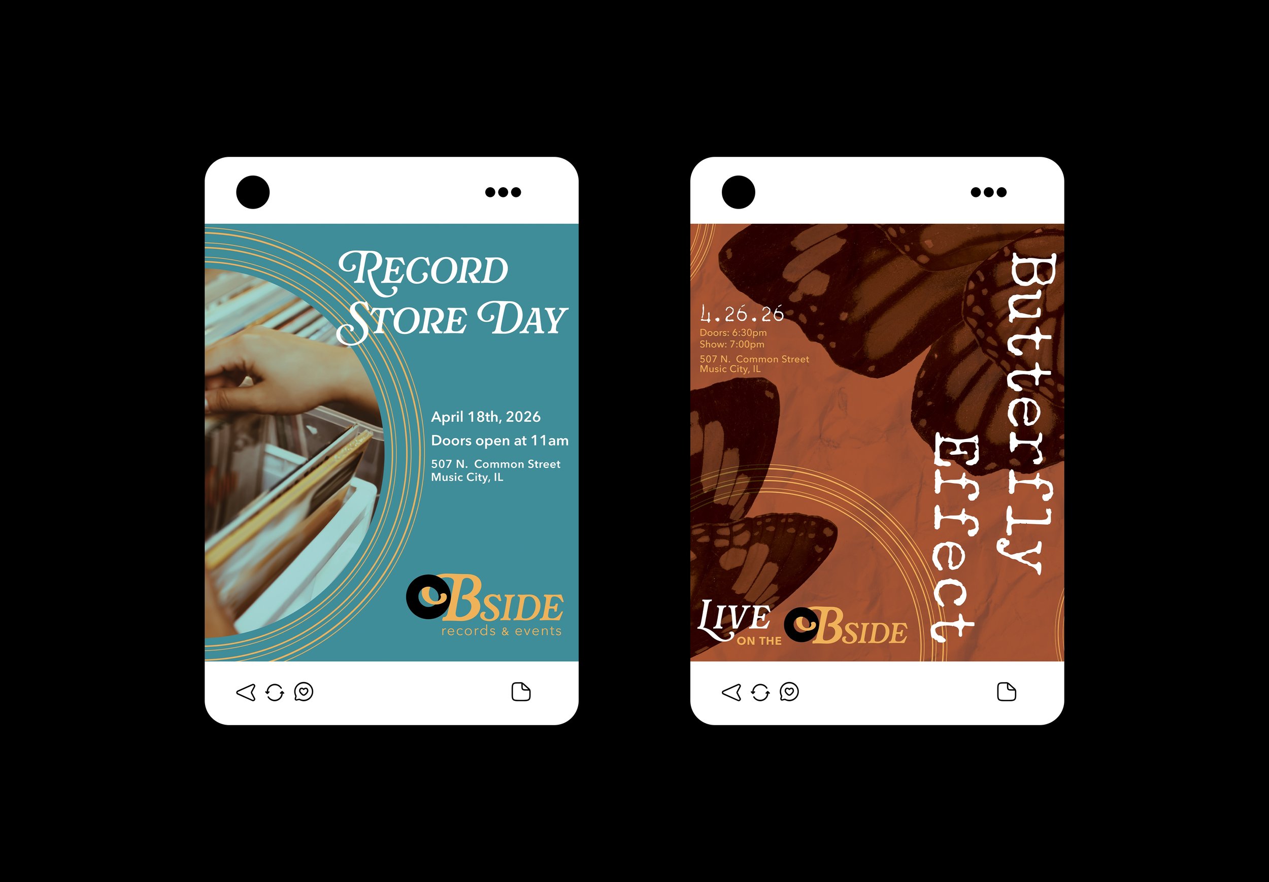
The burgandy orange crumbled paper texture is used in the background of concert advertisements.
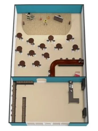
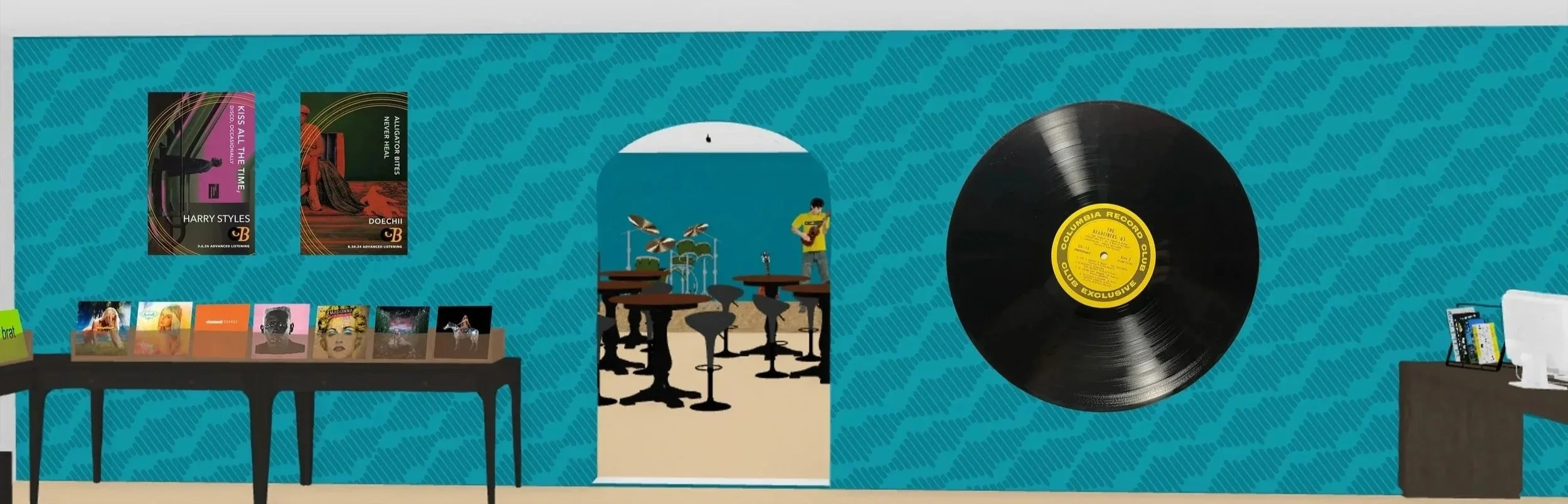
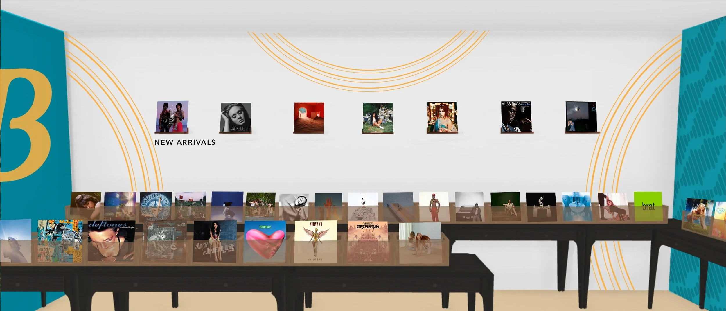
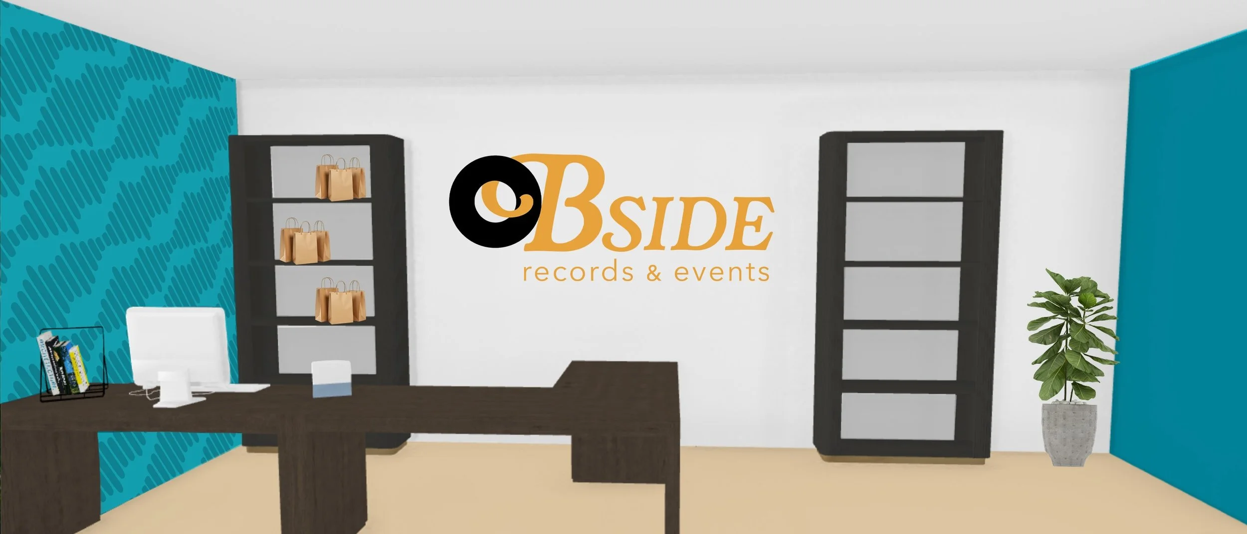
3D Mockup of Storefront
Deliverables